This guide includes helpful tips, wardrobe recommendations, and what to expect. It was designed to help you feel confident and prepared for your upcoming session.
Always reach out if you have any questions!
punctuality
Mini sessions are booked back to back. Please plan accordingly so we can start on time. I recommend you plan to arrive about 10 minutes early so you have a little bit of a "buffer" in case you need to freshen up the kids or change outfits. If you are late to the session, I cannot go past your end time to make up for it, so please keep that in mind! But I always do my best to accommodate everyone.
Prepping the little ones...
DON'T WORRY ABOUT BEHAVIOR
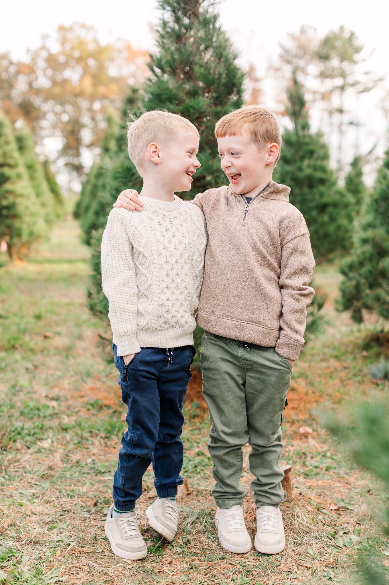
I'm a mom of four kids. I know how real family life looks, and that’s exactly what I’m here to capture. I know family portraits can be challenging and the challenge isn't a reflection of your child's normal behavior. You don’t have to apologize for your kids or stress about perfection.
SAVE SNACKS FOR THE END
If baby or little one needs a snack break, it's absolutely welcome. But, if we can, I recommend we save snacks for the end so they don't cause a distraction. That being said, snacks are a great incentive (and I completely support using treats as a bribe!)
JUST KEEP SMILING
Even if you're trying to get one child to giggle and engage, do it with a smile! So often, parents are worried about getting their child to smile that when the child does smile, the parent has forgotten to smile themselves. This is why genuinely having fun together is vital to the success of the shoot!
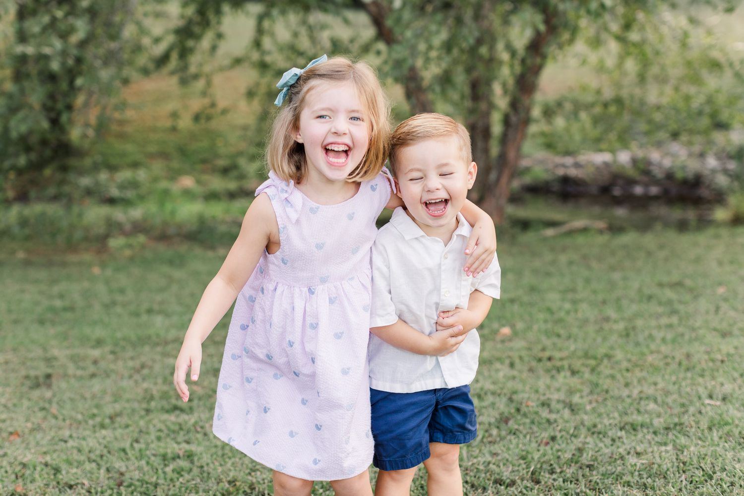
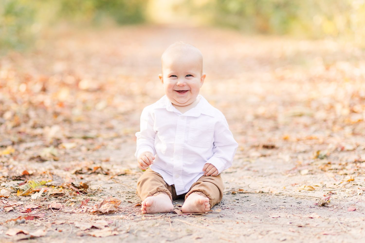
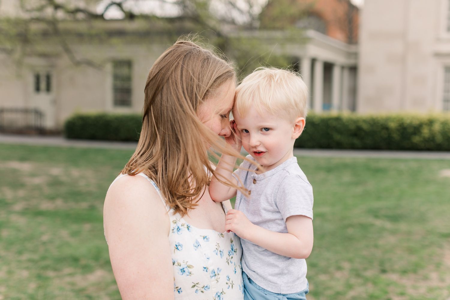
During your session, I’ll gently guide you with prompts that spark connection, laughter, and movement while still making space for those classic, frame-worthy smiles. The result is a gallery filled with candid moments, real emotion, and the kind of connection that doesn’t need to be perfect to be beautiful.
outfits
My style is bright and light, so my recommendations lean more towards creating that style of photo! As you read through these recommendations, please know that these are just suggestions and you have freedom to wear what you love! However, if you desire to have images that reflect what you see most often from me online, these tips will help create the look you're hoping for!
Neutral VS Bold
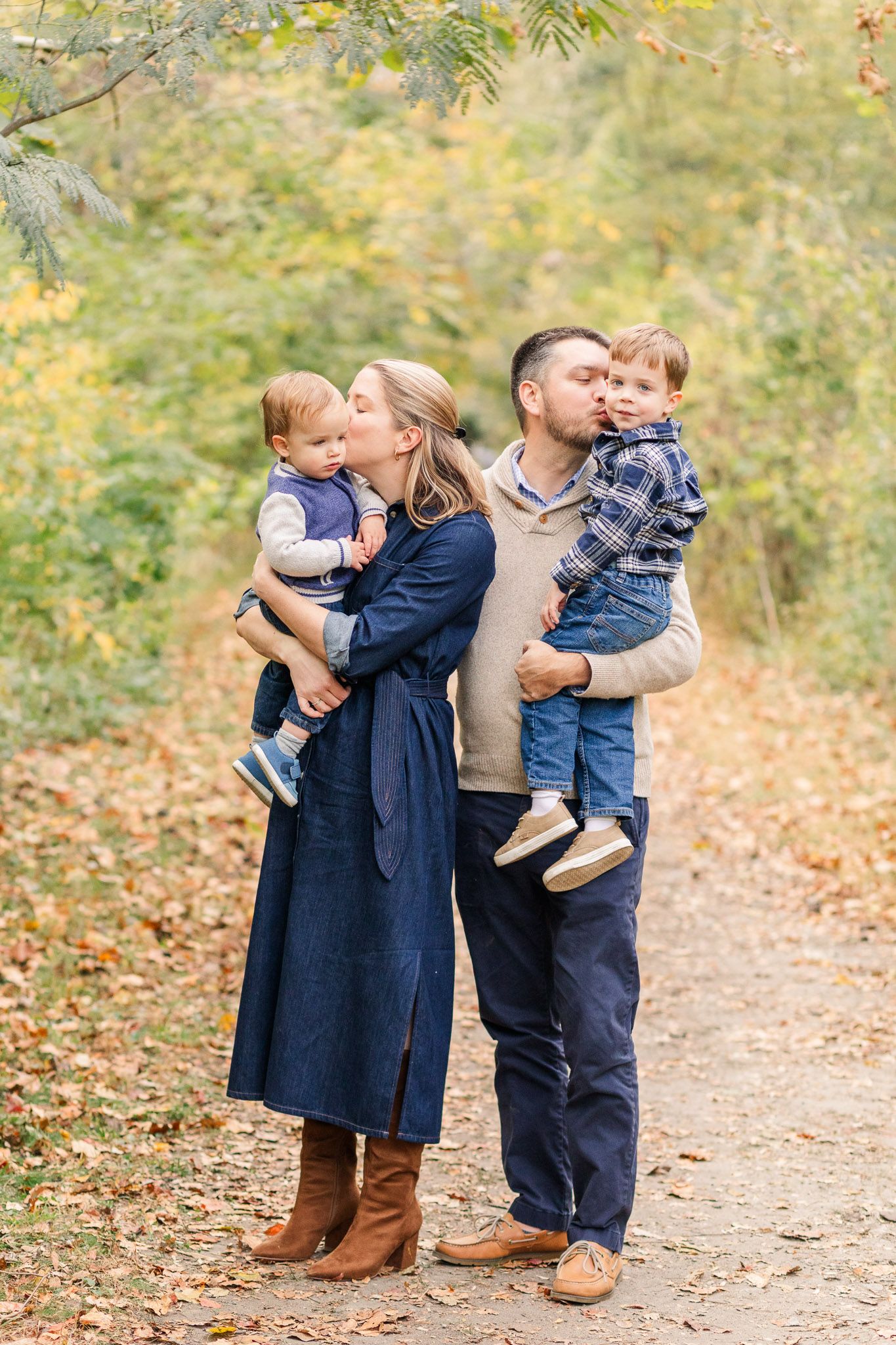
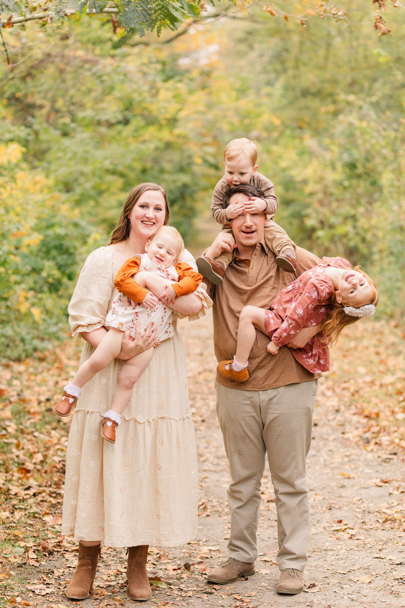
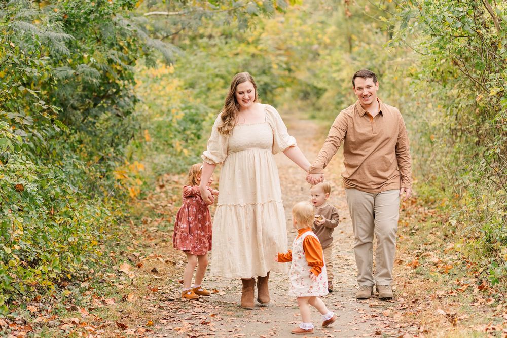
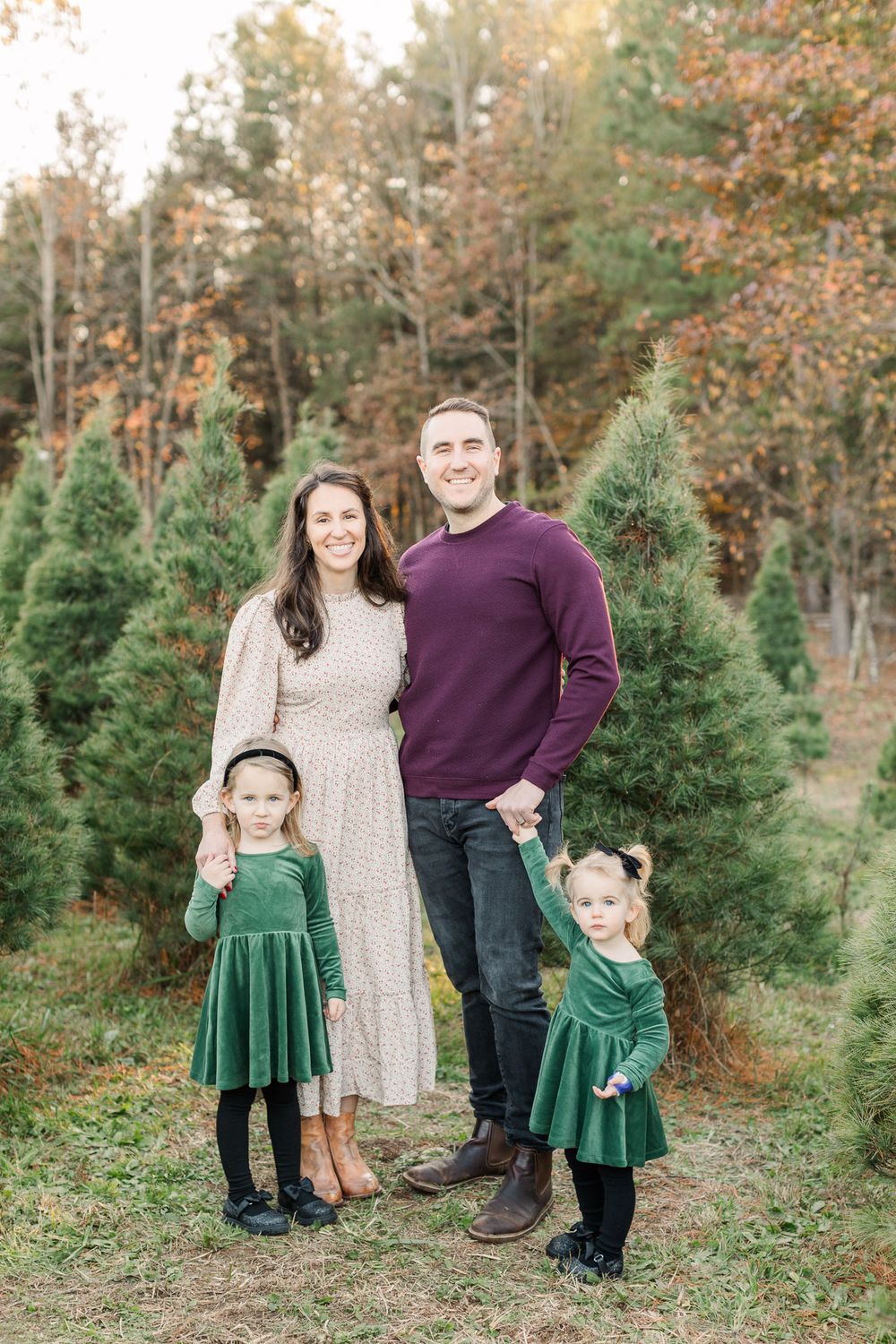
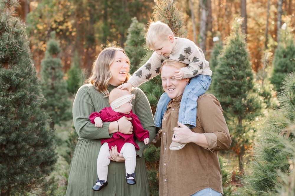
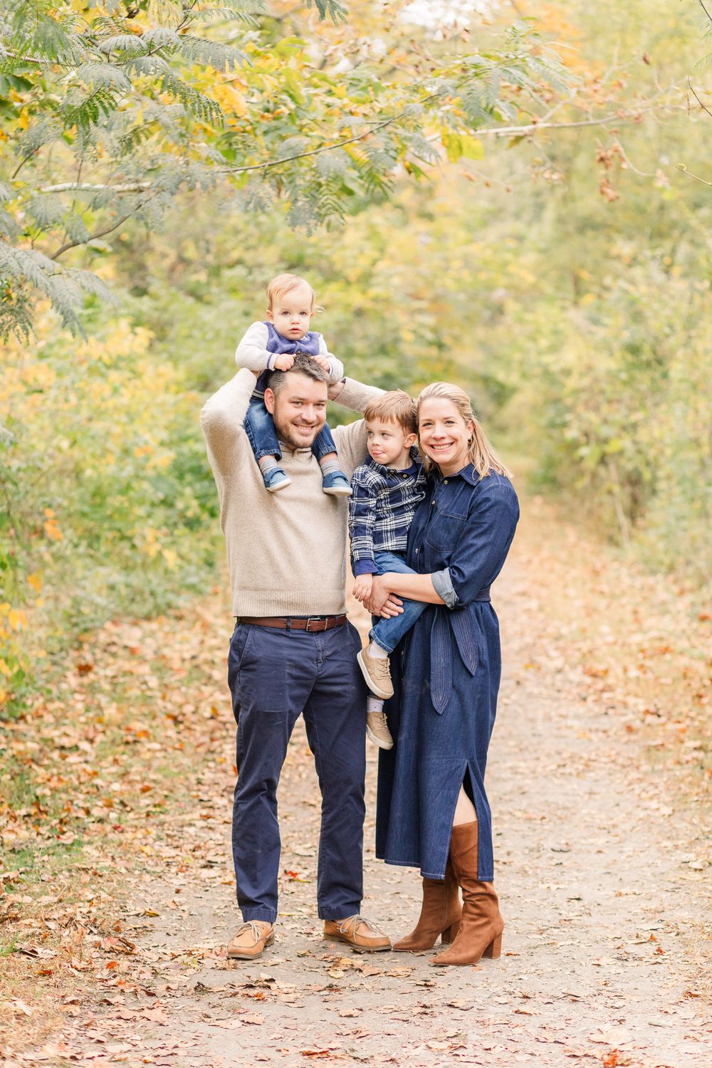
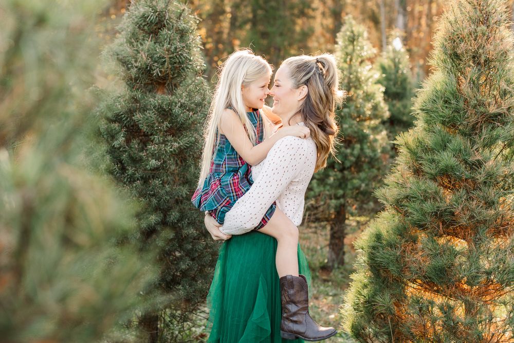
Neutral colors create light and bright images. Dark and heavy colors will create darker and heavier images. For example, having one or two pieces of denim won't have a huge impact, but if everyone in the family is wearing dark colors the overall image will be darker. This isn't a "bad" thing, it's just personal preference! My recommendation is to balance out the darker clothing by pairing with lighter pieces (if you choose dark jeans, wear a lighter shirt). The more light washes and neutral tones the brighter the image! In the three images below, you'll see a progression of heavy and dark outfit choices to more light and neutral. All the outfit choices impact the final image and they are all beautiful! I just want you to consider color choice when you think about how you want your final images to look.

Avoid Black
Moms, if you're like me, half my wardrobe is black. As much as I adore my comfy clothes and the safety of a black shirt and joggers, black is a color I try to steer clear of for portrait sessions. Black will instantly make portraits look heavier and darker. Black is great when you're going for a more bold look, but I recommend you pair with light neutrals or avoid it all together.
Avoid Bright & Intense
Super bright reds, oranges, yellows and hot pinks can be so vibrant that they will reflect their color on to necks and faces. This can be incredibly hard to edit out and in some cases, impossible. I would work hard to avoid any type of neon colors as well for this same reason! This is not true of pastel colors, only super bright and vibrant colors create this effect.
Avoid Tiny Patterns
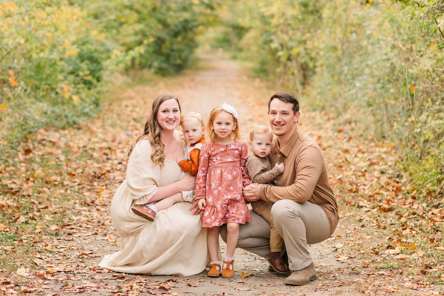
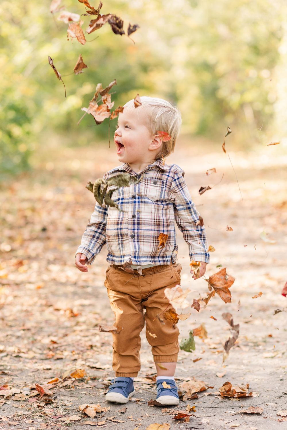
There is nothing wrong with wearing a pattern (I actually love them)! However, if you're going to wear a pattern, make sure the design isn't smaller than a dime. Small patterns can create a weird effect on the final image. Here's an example of a pattern that works really well and isn't too tiny.
Coordinate > Matching
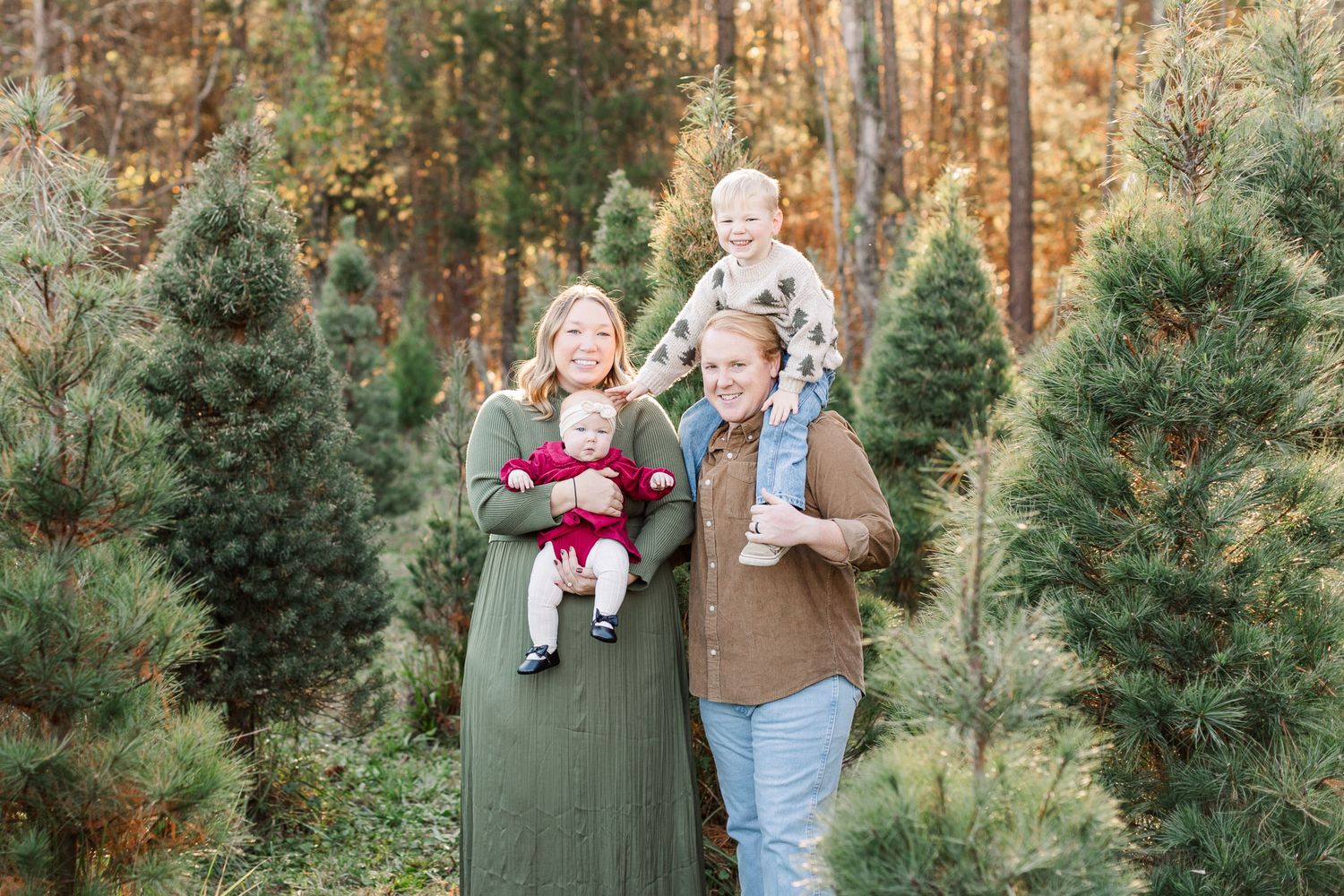
Your outfits will look the most cohesive on camera when the color palette and wardrobe pieces coordinate, but don’t actually “match.” The goal for coordinating a family is to break up the colors and shades so that you’re not all wearing the same color on top and bottom. Side note: I do love mommy/daddy & me matching outfits! There is always room for exceptions!
My favorite Fall/Winter color palette
I love how pinks, blues, and greens photograph and they are perfect paired with khaki, off-whites, browns, and grays. For fall and winter I like to lean into warmer muted colors. Bright warm colors tend to overpower an image and can reflect color onto your skin. You can wear red, orange, and yellow but choose the earthy, muted tone of those colors. Here is a sample palette of colors demonstrating how they all coordinate well together.

Inclement weather
If weather is an issue, I will be in contact with you as soon as possible. I always plan to switch everyone to the following day but in the case that we need to reschedule, I will do my best to find a new date that works best for you and your family. With weather being sporadic and unpredictable at times, I try to make a decision 12-24 hours in advance.
I can't wait to photograph you!
I'm so excited for your session! Don't hesitate to reach out with any questions or if you need any guidance.
hello@bloomphotorva.com
804.403.7074